Everyone knows the universal motto "sex sells!". We've got used to obscene commercials playing on our instincts, which doesn't affect us as much as it's supposed to. In fact, we buy products hardly because of that hot guy from the video or that gal whose tits are impressively huge, so it's a mystery what sex can sell to people who're fed up with aggressive sexuality. In his article What Is Art? Russian writer Leo Tolstoy defines contemporary art, tracing back to the Renaissance period, as the entertainment of wealthy people, with lust as one of its key elements.
Vulgar Venus
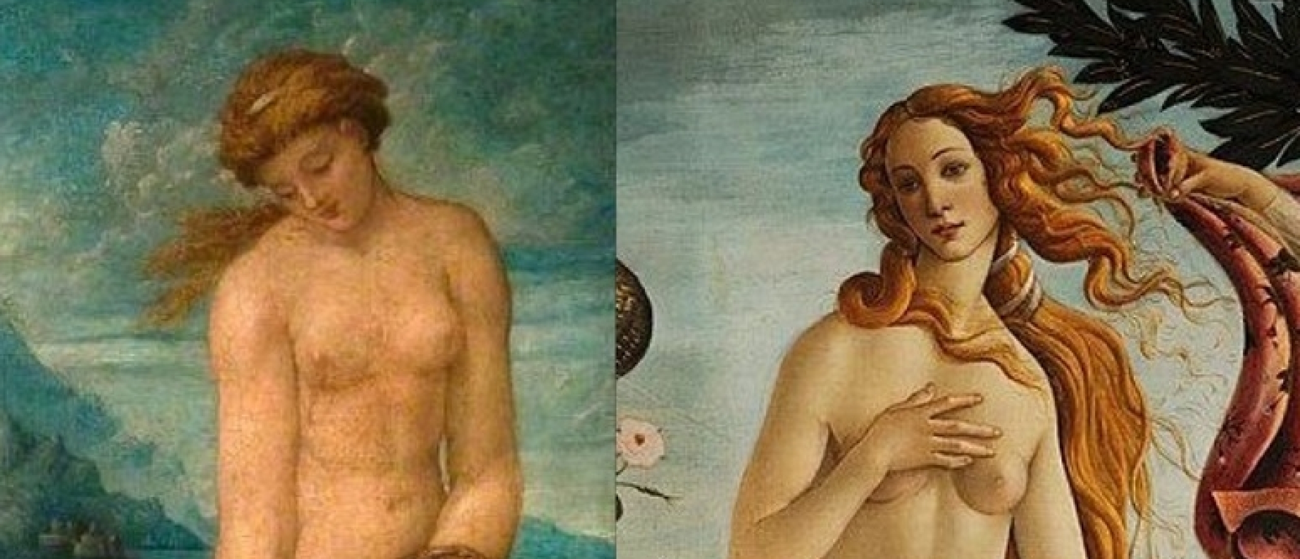
Looking at our times, we can say that lust or eroticism as a component of art is not a problem since true oeuvres can turn vulgar Venus into Venus Celestial. The problem begins where sexuality belongs not even to art but to marketing ("you are here"), and quasi-Venus leaves the sea only to promote a deodorant. Our previous top of covers was devoted to cheap pocket novels where tits, considering the content of such books, were totally appropriate and expectable, but cautious publishers censored them even there. This time, we've prepared the set of Der Spiegel's (The Mirror) covers, which feature is that the main topics of the included issues don't imply sex and sexuality. Let's look in this mirror of Venus of Marketing!

Why Sex? (sex as a mechanism of evolution), 41/2005
Daring Press
Der Spiegel is a German weekly news magazine with a circulation of 695,100 copies, which is the largest print run in Europe. The periodical, known for its investigative journalism, has been issued since 1947. It seems that revealing corruption and other political scandals may be of interest independently of what's on the cover, but this magazine pushes the limits even in print design. The first Der Spiegel cover with the female nude was published in 1966. The number of erotic covers in the 70s, 80s, and 90s was approximately 5 out of 52. When the main topic of the issue was directly connected with sex, which often happened in the 1970s and 1980s, designers indulged themselves and did what's hardly imaginable in other countries.

Justice and Sexuality
The Bullfight of Love In The Mirror of Europe
For instance, the seventh issue of 1978, devoted to German shows of Oshima's Ai No Corrida, features the explicit scene with Sada Abe strangling her lover during intercourse (you can read our articles about her). The abstract of the main article of the issue states that the movie was banned internationally, and it took a year and a half to deliver the film to the German viewer. At the same time, it took nothing for Der Spiegel editors to place the sex scene right on the cover of the magazine with large print runs... Quod licet Dem Spiegel, non licet bovi, indeed!

Lolitas For Sell
Romanian Lolita
Before we examine unmotivated sexuality itself, here's another interesting example of the design policies of this periodical. The 22nd issue of 1977 was devoted to child prostitution and showed nude Eva Ionesco on its' cover. Afterward, this picture became one of 4 or 5 risky images that were deleted from the Der Spiegel archive.

Fig. 1. Living Underground
The Trademark of a Prostitute
This cover belongs to the 49th issue of 1995 devoted to the theme of illegal immigrants. It depicts three "foreigners": two dressed men and one woman with a bare breast. Those who remember our top of nipples' censorship may feel like all these nipples covered by all possible objects took their revenge finally! Well, this time we'll face a situation that's opposite to what was on the covers of pulp fiction. The female nipple (they often show only one breast) will watch you like Sauron's eye from places where it's hardly expectable. Though the theme of illegal immigration is directly connected with prostitution, how many street prostitutes boasting of their nudity like Helmut Newton's models have you seen?

Fig. 2. To Whom Belongs Mallorca?
The Real Problem of Mallorca
Another frivolous cover crowns the 31st issue, 1999. The topic is the increasing number of Germans who live on Mallorca island. Looking at this cover, we can guess what's the root of the German conquest of Mallorca. If you've scrolled down our top (yeah, there was another one) of Stanley Borack's covers, you probably remember that the silver place was bestowed upon the cover of Jay Martin's Ban the Bra! written in the 1960s. Apparently, the authorities of Mallorca recalled this slogan thirty years later and tried to test the ban. The cover of Der Spiegel depicts the very first day of the new law. That's why, looking at the woman, we still see the absence of tan in the area of the bra. Nevertheless, even one day turned out to be enough for Germans to rush to this promised land!

Fig. 3. Biochemistry: Man Will Be Changed
I'll Teach You The Overman
The 52nd issue of 1970 invites us to speculate upon biochemistry and its dangerous potential in modifying humans. The funny thing is that the article begins with a quote about the overman ("superman") from Thus Spoke Zarathustra, and the cover shows us a superwoman, which, as known, wasn't the goal of Nietzsche's philosophy. The German thinker regarded child-raising as a crucial task of today's humankind. From this point of view, the woman is already perfect enough because she was naturally "developed" to produce offspring, while the function of man is not so clear because the male is not even an incubator but merely an instrument of the incubator. In the light of this thought, Der Spiegel designers, aiming to make the cover attractive and provocative, depicted the reinvention of the wheel! By the way, this "misconception" was corrected in the 39th issue, 1999, where der übermensch is depicted as a statue of a man.

Fig. 4. Custom-made People
Artificial Tits Attack
The 47th issue, 1983, is also devoted to the artificial remaking of the human organism. And again, we're met by the nude woman with bare breasts as if unnatural tits were the real danger of the progress. We can only imagine what would be on the cover of the Der Spiegel issue devoted to Silicon Valley...

Fig. 5. Doctors vs. Bonn
Expensive Doctors And Unintentional Voyeurs
The 8th number of 1977 tells us about the doctors' strike against the draft of the law that's supposed to stop the growth of prices for medical services. "Medical treatment only for cash!" reads the note on the door. The lady behind the door looks at the viewer as if saying that she's surely paid for her visit but not in cash.

Fig. 6. The Plundered Patient
Hands Up, It's a Robbery!
The 44th issue of 1999 also focuses on the costs of medical services in Germany. The nude woman with her hands up symbolizes a plundered patient. Well, hands down, the problem must be a subject of discussion, but why not place a male patient on the cover? Or women are the only kind of patients in Germany to be robbed by local medicine?

Fig. 7. Healthier, Better, Longer Life

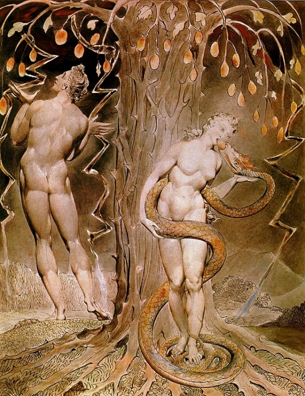
Fig. 7a. The Temptation and Fall of Eve, 1808 (Wikipedia.org)
Inspired by Blake
The 38th issue of the same year examines the market of German medicine. Conceptually, the cover seems to be on point because it depicts the snake from the ancient emblem of pharmaceutics as the serpent-seducer of Eden. The composition as a whole reminds us of William Blake's watercolor for "Paradise Lost," which depicts the temptation and fall of Eve (Fig.7a). At the same time, Blake portrayed Eve standing next to Adam. If the modern serpent of medicine tempts only Eve with no Adam in sight, does it mean that the first man was cleverer than the woman and ate the fruit from the tree of life instead to become immortally healthy? To tell you truth, we'd like to read this version of the Book of (Partheno) Genesis with Eve multiplying herself alone after being expelled from Eden.

Fig. 8. The Secret of Life.

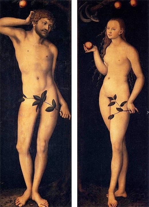
Fig. 8a. Lucas Cranach Adam and Eve, 1528 (Wikipedia.org)
Inspired By Cranach
Several years later, the 9th issue of 2003, celebrating the 50th anniversary of DNA structure's discovery, would have the biblical couple on its' cover. This time, designers took their inspiration from Adam and Eve diptych by the German painter Lucas Cranach the Elder. Both in the painting and on the cover, Eve offers an apple to Adam, so the fall hasn't happened yet. Nevertheless, they've already covered their genitals with tree branches. Unlike Cranach, Der Spiegel's designers didn't cover the genitals of Eve but gave the branch to Adam. This time, it was Adam who initially somehow ate the fruit from the tree of knowledge before Eve. Or God doesn't like penises, so he told the first man, an imperfect draft of human being, to hide this disgusting thing behind something.
In Premium you check out the second part of the article (which can be read separately from the first) with more tantalizing covers....!!
Sources: spiegel.de
Click HERE for the top 30 most trashy erotic magazine covers of Hara-Kiri.....!!


